Thursday 2 October 2008

What is Graphic Design?


I have had this book since first year as i thought that if i was about to embark on a 3 year course on the subject it would help to thoroughly know 'What Graphic Design is.' 
The book is highly illustrative and a great resource for trigger idea's where you can take inspiration from other works...good if you have a thinking block!
The book looks individually at area's within graphic design and how they have developed and progressed from it's early origins. It is a great source of information for a broad range of disciplines under the name of 'Graphic Design' including websites, television, magazines, typography and branding. Most design students have an area within G.D which they prefer and sometimes become fixed on. This book is a journal that will help the reader to acknowledge all area's reminding the them that it is good to keep an eye on all area's within design and take inspiration from a variety of sources from both past and present.

Tuesday 30 September 2008

Tate Liverpool.


Anthony Gormley: Field.

I was lucky enough to see the British Isles version of  'Field' four years ago in the Tate Liverpool. 
The first Field instillation was made in America in 1990. Thirty thousand figures were made by around 60 people. Participants were given a simple brief: Create a hand sized easy to to hold figure, eyes are to be deep and closed with the head in proportion with the body.
Figures ranged in size from 8 - 26 cm in height.
Liverpool created a locally made instillation four years after displaying the original. This was made in the same way by people in the local area's.
The exhibit is extremely memorable as their are so many pieces to make up one piece. The figures are human like but when they are together they form a landscape effect. The exhibit was placed in a room and filled up every inch so onlookers could only peer through the door which limited perspective. But the little figures are returning our gaze through the door so are we the exhibit? 

The Tate describe the installation as an invasion that has become temporarily limited by the architecture of the room. 
A bit like a goldfish that grows to the size of its tank?


Monday 29 September 2008

http://www.jaiperdumoncell.com/

I came across this website on the design charts website it was ranked at number 10. The website is french so i'm not 100% sure what it is for? I think that it may be for student phone contracts. If anyone can speak french i'd be grateful for a summary! 
Anyway i chose to write about it as even though it is in a foreign language i can still appreciate the quality of it's production. There is an interactive part to the site which i like where there are different free ways of communicating its quirky and well illustrated. The music suits the websites image. It is young and funky and adds to the website visit experience.

Tate Britain. JMW Turner.


I visited the Tate Britain a couple of years ago and was in awe of the JMW Turner collection of oil paintings. The colours were gorgeous. His paintings captured the effects of sunlight on nature and landscapes. The majority of his works are impressionist like and it has been suggested that Turner was responsible for the later movement.
I think that this advertisement for a personal trainer is really clever. It is original and witty as it relates to the service that will be provided. - Everything will become tighter!

Less is More.


Packaging Design.
My A level graphic design teacher hated Easter egg packaging 'Far too much packaging, what a waste'. - A waste of materials and a waste of energy. 
Apple must have thought the same as they have dramatically reduced their iPods and iMac's packaging, product mass, sleep energy consumption and most dramatically lead consumption. Apple reduced packaging for many software titles by more than 50% in 2006 which reduced hundreds of thousands of pounds of packaging waste. 
Apples products are now also made out of highly recyclable materials such as aluminum and glass. I consider Apple to be a great innovative company and their environmental responsibilities are also inspirational with great designers and idea's their products have the ability to offer excellent environmental performance throughout their life cycle.

My name is Lisa Video.


my name is lisa Video

Posted using ShareThis

This short film deals with the illness Alzheimers. Lisa is the daughter of the woman suffering the illness. At the beginning of the film Lisa has been inspired by her mother to produce a film that will log her preference for books over films. This suggests that her mother is a book lover and perhaps highly educated.. not because she can read but because she has strong feelings and thoughts about literature.
The Alzheimer's case highlighted shows the illness from its early stages where the symptoms are laughed off to a quickly progressed form of the condition. It is a sad film which portrays Lisa coming to the realisation that her mother is ill. With the realisation comes a range of emotions as Lisa comes to terms with it. Each scene shows the illness in a progressive stage to the final clip where the mum does not recognise her daughter any longer. 
The outside scenes i feel are important. Lisa comes home from school not knowing what she will find. Not the easiest situation for a 13 year old to deal with.
superlambanana for sale! Auction.


In an earlier post i mentioned that Liverpools beloved superlambana's were up for auction. I went to visit the collection that was up for sale and took a few pictures to sum the quirky sculptures up.

Butterface

I came across this video when i heard about the Virgin Media shorts competition where a panel are looking for the next big thing in film. Entrants could upload their short films with the hope of being picked and also just to get their films 'out there'. A short list has now been wittled down and a winner will be chosen tonight. 
Out of the shortlist i liked this video. I think that its well directed. It is simple but at the same time complex and also very thought provoking.  The story is sweet it explores the chance meeting of two people on a train. You can hear the thoughts of the man, he seems to be insecure and is trying to muster up the courage to speak to the girl. Its quite humorous and as you can only hear the guy's thoughts you are oblivious to what the girl is thinking and how she would react if he does make a move. The video generates the concept of 'What are other peoples private thoughts about yourself, anybody's a chance meeting or somebody that you pass on the street. There is no way of knowing. the end of the film reveals the girl's thoughts on the man and if only one had have had the courage to speak their meeting could have progressed in to more than just a train ride.

YSP. Moore special.


Yorkshire sculpture park.
I first visited the YSP a couple of years ago on a school trip. It is an inspirational place where i have recently returned to. The Sculpture park has an impressive Henry Moore collection on loan from the Henry Moore Foundation, The Tate Gallery  and Tower Hamlets. The collection represents a lifetime of iconic sculptures by the artist but this collection i think is a bit more special than others. Why? Because the collection is beautifully set outdoors in the Yorkshire sculpture park. Moore's early inspiration for his work was said to be the West Yorkshire landscape so where better for the pieces to be exhibited! As well as looking at the sculptures it's hard not to take inspiration and interest in the grounds especially if you spend the whole day there and can see the changes that natural light can make to the artworks and environment. 
If you do choose to visit the park there are a number of attractions to visit with some of Andy Goldsworthy's latest nature sculptures and Eduardo Paolozzi sculptures that i think work differently to others with the landscape. Perhaps in a contrast.

Saturday 20 September 2008

Andy Warhol. Muse.


I've wanted to watch factory girl for a while but not that it's relevant, i was unsure who else to watch it with. It's based around Andy warhol's dysfunctional film muse Edie Sedgwick who helped him change the modern art world. I'm actually watching it now alone whilst writing this blog and I'm not to sure what to make out of it. The main character Edie has had a troubled life and her problems attract Warhol to her he seems somewhat obsessed and treats her as a possession. He finds her personality addictive and they live an extraordinary care free life.  The characters are all full of enthusiasm about objects that most people in the generation would not understand. The passion for little things is intreguing as designers we also need to pay attention to detail.
It does make uncomfortable viewing in some parts watching Edie live her troublesome life ignoring problems and not facing up to reality but non the less it is does keep you wondering what will happen next.

A Very Thourough Book List.


I visited this blog in search of some inspirational books to start my third year of university with. Books that would inspire, influence and motivate me. i came across the following website.

http://www.allgraphicdesign.com/graphicsblog/2008/04/27/best-graphic-design-career-and-business-books-ultimate-list-of-books-for-freelancers-new-designers/

It lists a great reading list to help students fresh out of university with the next step, succeeding in your career. A library of information available when you no longer have your design tutors to answer your queries.
Instead of the usual book lists where your given a name and very little information about the book, the author here gives a thorough explanation of what the reader can expect. This way you can decide from this overview if you think that the book would suit your needs or perhaps stop you from buying a book that you already have something very similar too.

The list composed does look good and i did recognise a few of the titles and do own one myself. From reading through the list i have been motivated to purchase 'The Savvy Designers Guide To Success: Ideas And Tactics for a Killer Career' It looks quirky and less formal than the other books and also the first book on the list "Becoming a Graphic Designer" as it starts from the beginning specifically outlined in the review is education and portfolio management which are very relevant to me as a final year student.

The list would probably be more helpful next year but i am gad of the advise given to help my future.

David Aaker. Building Strong Brands.


For my third year dissertation i intend to look at brands and their influences on consumers. I have used this book to do some initial research. I found it really helpful and Aaker clearly outlines brand objectives and how they use strategies to succeed. The book has lots of case studies to back up Aakers objectives which are also an interesting read and broadened the readers knowledge of brand history. As-well as success stories there are the failures as well which i also feel is good as you can experience both ends of the win loose spectrum. What to do and what not to do in so many words! The book is great for students like myself but i can imagine that it has been used in the industry to learn from past mistakes and success stories. 
David Aaker is generally regarded as the worlds leading academic authority on branding strategy so in a lot of peoples opinions he knows what he's talking about! 
A wide variety of topics are covered from Brand strategy to personality, identity to symbols and each topic thoroughly covered in an interesting way. The book is wrote as if Aaker is talking to the reader which keeps it light hearted.
David Aaker 
" A brand without a personality, not unlike a person lacks friends and may easily be overlooked"

Cable Tie Art.


Its hard to believe that something so impressive and beautiful could be made from something as standard and function purposed as a cable tie! 
In my opinion this is living day proof that something can be made out of nothing! I think that this is a great innovative way to give something a duel purpose - who says cable ties are boring! With the right light this temporary structure made by design students in Munich has become a "Third World" as it has been named. It appears somewhat dreamlike and visitors to the attraction can interact with the space by sitting in/on or under it. 
This piece reminds me that products are what you make them and with some creative tinking you really can turn anything around for the better.

Film quotes


"Bond - James Bond" obviously James Bond 

"Life is like a box of chocolates, you never know what our going to get" Forrest Gump.

"I'll Be back" The Terminator

"You can't handle the truth!" A few Good Men

"There's no place like home" The Wizard of Oz

As a designer interested in copy writing I'm intrigued by recognisable film quotes . Most are a few words, no more than a sentence but will be remembered for a lifetime. In some cases the quote can be the most memorable thing about the film. It may even be the way that you describe the film to a friend "Oh you know it, the one that says..."
So out of a whole film script why and how do one liners become iconic? Is it the placement in the film at a memorable point in the story? or is it the content of the line, it's significant meaning? 
The James Bond quote is used over and over again so it's easy to analyse why it has stuck. The Forrest Gump line is clever and i think that a lot of people could empathise with the meaning of the quote, life is unpredictable, you need to take chances as your not always in control. Forrest Gump is full of classic lines and memorable scenes but this quote is like a life lesson!
In a Few Good Men Jack Nicholson's line comes at the climax to the film, a turning direction in the plot. It comes as a shock to viewers so stands for the whole seen i think. 
The above quotes will undoubtedly by repeated for years to come, with The Wizard of Oz quote lasting the length of time already.
When creating memorable copy it may be worth while to bear some of the success stories of the above quotes in mind as in advertising being memorable is a primary consideration. 

Hear How You run. Nike.


It's over now but i thought that Nike's human race idea was great. Not just the bringing together of different countries to do a 10k race but also the technology available to the runners after the race was run. 25 countries held a 10k race for people to participate in, along the way qould be music and events to keep the runners motivated. the concept was great for Nike as a brand as it generated lots of word of mouth and provided an opportunity for their customers to show off their trendy running gear. But more seriously nike were the centre of fund raising for charity. They created an event that would generate sponsors that would be donated to charity's all over the world.. Nike, thinking of the greater good! 
Once the race had been run, runners could compare their times with other competitors from all of the other 25 cities over the world so it was kind of like one big giant world race. You could rank how you did personally or as a country. And even better if you couldn't take place in the main event then you could run your own personal 10k run and still have yoyur score included. I'm guessing you get sent a chip to put in your shoe or something? 

Friday 19 September 2008

Lost Soul


I was recently invited to watch a play in The Royal Court Liverpool. It was a comedy and nothing like i had ever seen before. The Play was 'Lost Soul' I knew nothing about it so went in to the theatre open minded. The play was about a local family who have grown up through the decades in Liverpool.  There are two couples in the play who met in the seventies who are uncomfortable in their current lives constantly referring to the good old days of mow-town. Instead of living in the present and being grateful for what they have achieved they pick fun at how the liverpool nightlife and culture have changed to something beyond their recognition. It highlights differences between generations and how generations are ignorant to each others likes dislikes and lifestyles. The play is funny and refers to some local pubs so makes the audience feel involved and for the older audience members, they may feel like they can further relate to the characters. 
After watching the play i was able to relate the story line to my own design work. I must remember to keep the target market in mind at all times as my likes and disilkes may not always work for a brief targeted towards another social group, and for the work to be as successful as it can be the designer must always consider the bigger picture.

The Disney Icon


"I hope that we don't loose sight of one thing - that It was all started with a mouse!" Walt Disney.
Mickey Mouse is one of the most recognisable symbols established. He stands for Disney, who have Ranked 8th in the top 100 global brands. The Brand has recently expanded as a result of taking overthe 'hit animation movie maker' Pixar. Pixar are fantastic animators who have recently created the latest Disney Pixar cult film Wall.E amongst a long list of others such as Toy story Finding Nemo and Monsters Inc. Disney created the first animated short feature film with a post - produced sound track of music, dialogue and sound effects which back in 1928. By comparing the differences of the films that are separated by 80 years we can relish in the improvements of animation and how technology has significantly improved. 
 

Jurlique shops


Jurlique create superior beauty and skin-care products with ingredients from their own farms. They are self proclaimed pioneers of biodynamic beauty. Their brand is pure and organic and feels truly natural, clean and good. 
I have chosen to look at the brand as they have kept their strong brand values clearly apparent in every aspect of their business. The fore front of every retail merchant is their store. Jurlique's trading spaces are a pleasurable experience. The layout is spacious and calming with clutter kept minimal. The nature that makes their products is echoed through the authenticity of the displays. There are no promotional advertisements pushing for a sell and the colour scheme is plain, natural and uncomplicated. I think that it makes good business sense to keep loyal to initial core values as it only makes the brand stronger and more recognisable. The store is made to a high quality although it is minimal just how the company would want their products known. Natural goodness!

Christo & jeanne claude.


Christo & jean Claude are a husband and wife, artist partnership. I have admired their work since i first discovered it a couple of years ago. The pair work on a gigantic scale wrapping buildings and man made objects in meters and meters of fabric. I love their iconic projects as the fabric conceals what is underneath although the human eye and brain recognises the familiar shape and can instantly recall associated imagery. The Ford Kuga 'Blank canvas' advert is similar where the advert wraps up a city in white paper and exclaims why do we keep following the same design rules, imagine if we could start again with a blank canvas. Christo and Jeanne Claude insist that their work has no deep meaning just that it is purely aesthetic. There works are made as they believe that they will look beautiful. The artists create the pieces for their own pleasure and if the public enjoy it as-well then that to them is a bonus. Which on a larger level is very personal. The temporary art work is on a huge scale but compared to purpose built buildings such as skyscrapers and airports the novelty is somewhat dwarfed. The novelty however of the art is that these wrappings are not purpose built with a function. They are made enormous simply to admire.

Thursday 18 September 2008

London on Tap


In all of the U.K London has the best quality tap water and often out performs on taste tests beating alternative bottled water. So if your living in London why pay for your water when you have even better h2o with the turn of a tap for free. 

Thames water & the Mayor of London have launched a design competition to create an 'iconic carafe' which would be used to serve tap water in restaurants, bars and hotels through out the city. It will help to rid the stigma of asking for tap water when dining out, hopefully changing perceptions, attitudes and the image of tap water. 

It is kinder to the environment to drink tap water instead of bottled and a lot less cheaper in terms of production. So hopefully the campaign will also appeal to green customers.

Ten candidates have made the short list for the carafe design. The popular designs chosen have taken water for their initial inspiration. 

The first image takes inspiration from a  water pipe. Second, the visual of running water. Third a brass water tap.


kaleidosope!

I think that this is a great interactive website! I know that it's not 'very grown up' but it's fun! 
You use the shapes available to make a pattern in the circle and the larger circle in the yellow box shows you your pattern in kaleidoscope form! It's ultra user friendly and provides hours of endless fun! There is an improved more scientific version of the website but i couldn't figure out how to work it!  :(

www.zefrank.com/byokal/kal2.html

Revolutionising Online shopping!


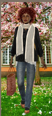
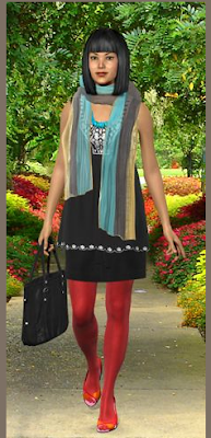
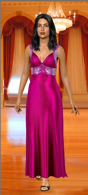
My Virtual model is a website that has revolutionised online shopping for consumers and taken buying clothing online a step further. When buying online you do not get the chance to try the garment on and have the 'dressing room' experience... for some people they find that a good thing and tend to use online shopping for this reason. Another reason is lack of time! If some people find that their only spare time is after 9pm on a weeknight the only clothes store they'll be going to is the local 24hr supermarket. Not a great variety! So shopping online as we all know it now where you see a picture of the garment has been a great help!  Some websites also have 'runway models wearing the item which helps give the 'on me look' but unfortunately were not really going to look just like the 6ft super model are we. So here's where My Virtual Model. com has empathised and improved the online shopping experience! Virtual Model allows the user to create a virtual them. The user can enter there body details like height, weight, bust size, hairstyle and users can even upload a photo of their own face to the model to create an on screen copy of themselves. From there you choose a type of clothing for example a dress and the site will search an archive of websites that include H&M for other clothes that it thinks will 'match your style'.

Stallion of the South.


Eurostar are opening a new station at Ebbsfleet. Problem is hardly anybody knows where this ebbsfleet is! To place the town in Kent on the map an Angel of the South competition was launched with a 164 ft statue of a white horse being the successor.  The Stallion will be higher than any public artwork and will be placed on a site that could hold over 50 football pitches.It is hoped that the work will become as popular and well known as Anthony Gormley's 20m structure near Gateshead. Passengers arriving from Europe into Ebbsfleet will find it hard to miss as the countryside zips past through their train window. Apparently no person will be taller than one of it's hooves so that can help to paint a scale picture in your mind!
So why a giant white horse? Apparently the white horse is a symbol of Kent. Which derives from Anglo - Saxon times when people from Germany and Denmark came to live their. Thus suggesting that the sculpture refers to immigration and traveling. Which also fits in the the Eurostar connection to Europe and the EU.
Flower Mantango 2001 - 2006

Louis Vuitton & Takashi Murakami design.
Art influencing couture.


What the Font??

What The Font? Is a handy website for identifying unknown fonts. Users upload a good quality scanned image of a sampled typeface to the website www.myfonts.com/WhatTheFont/ and in return the site will produce the typefaces name by identifying the typefaces glyphs and comparing it to a database. The site apparently has a very high success rate but if in some rare cases the typeface cannot be identified What The Font also provide a What The Font forum where users can upload the typeface and ask other typeface enthusiasts to help identify it.

A Smile in the Mind

This is one of my favorite Graphic Design books to flick through for inspiration when i have a bit of a mental block in my design work. As the title suggests the book is full of witty GD from other designers over the past 30 years. The book is highly illustrative and ranges from adverts to packaging, letterheads to invitations. The work inside is simple and quirky. Clever in a way that it works effortlessly to make you smile and in return it is memorable. It encourages the designer to keep it simple and fun advising readers that the best ideas will come easily most likely when your not trying. The book also includes interviews with 26 of the worlds top designers including Milton Glaser and John Gorham. 

Mr Jones watches.


Wrist watches are being quickly phased out by the ever increasing use of mobile phones and computers. Why bother wearing a watch when you always have your mobile phone by your side... and you don't have to worry if it matches your outfit!
Crispin Jones and his Mr Smith collection has playfully created a range of wrist watches with alternative functions. The watches are fresh and humorous creating solutions to other everyday problems whilst wrapped around your wrist. The above watch 'The average day' displays the time in a day as possible activities rather than hours. The top watch helps the wearer make quick decisions with 'Yes' and 'No' alternating so the wearer can make fast decisions with a glance at their watch. This one would be very useful for myself.

Resourceful Art and Design.


Across Africa citizens have long been creating products from recourses that we here in the west would discard as rubbish. There creativity and craftsmanship shows that you really can make something out of nothing with a little imagination. As well as making products that help their daily lives, products are also emerging from Africa which are being exhibited across the world that are innovative quirky and full of character. A few examples are shown above. Picture frames that can furnish homes made from glass, suitcases made from tuna cans and lined with comic book pages and toy chickens made from plastic bags! Even though the artists have made these products out of waste they are certainly not rubbish! Their colouring is bright and I'm sure if you had one of these products then it would definitely be a conversation starter with it's unique origins and you would also be doing your bit for saving the planet!